


-

- August 30, 2023
Complementary Colours That Will Make Your Bedroom Pops
Complementary colours can have a powerful impact on the overall look and feel of your bedroom. By understanding the principles behind these colour combinations, you can create a space that truly pops.
This article will guide you through the world of complementary colours, helping you choose the right combinations for your bedroom and create a harmonious colour scheme. We will explore both warm and cool combinations and discuss how to incorporate texture and patterns for added visual interest.
Additionally, we will discuss the importance of natural light in enhancing complementary colours and provide tips for painting and decorating with these vibrant hues. Finally, we will explore how to transform your bedroom with complementary colour accents, allowing you to create a space that is both visually stunning and personally satisfying.
Understanding Complementary colours
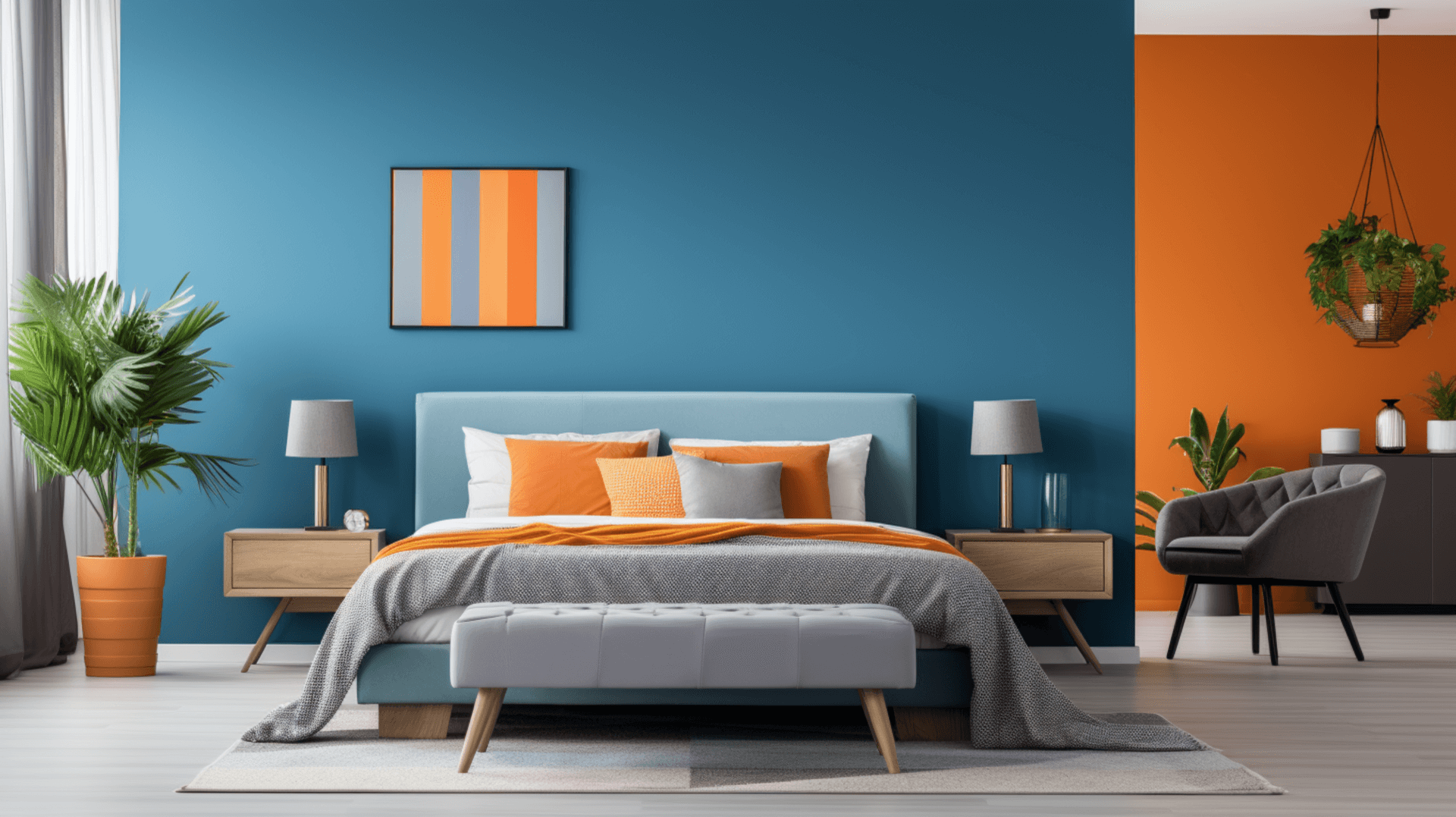
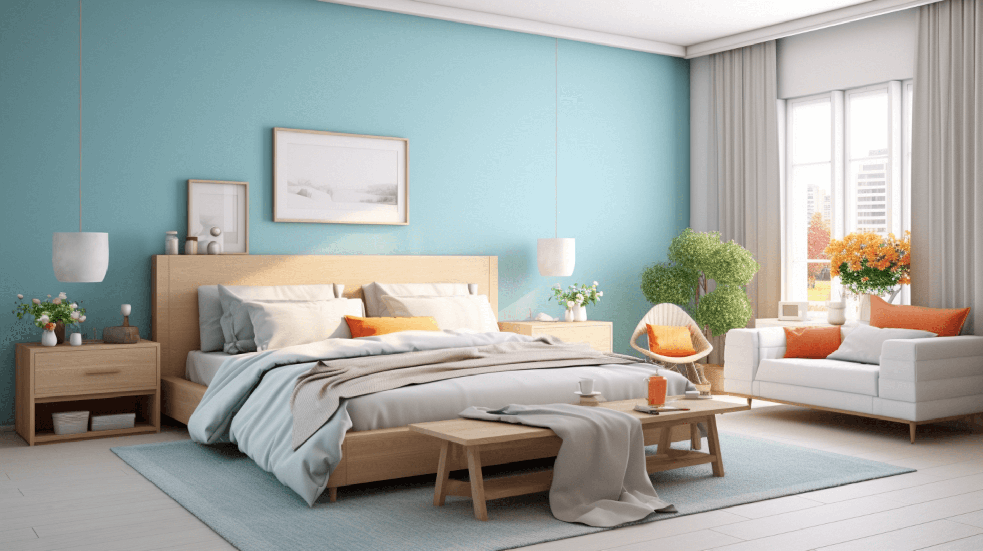
![]()
Complementary colours are pairs of colours that are located opposite each other on the colour wheel and provide a visually striking contrast when used together in interior design. They are known for their ability to create a vibrant and eye-catching effect in a room.
Understanding complementary colours is essential in creating a harmonious and visually appealing bedroom. When two complementary colours are placed side by side, they enhance each other, making them appear more intense and vibrant. For example, blue and orange, red and green, and yellow and purple are all examples of complementary colour pairs.
By incorporating complementary colours into the bedroom, one can create a dynamic and energetic atmosphere. Alternatively, using complementary colours sparingly can also add visual interest and create focal points within the space.
Overall, understanding and utilising complementary colours in bedroom design can greatly enhance the overall aesthetic appeal of the room.
The colour Wheel: A Guide to colour Relationships
The colour Wheel, a fundamental tool in understanding colour relationships, offers a comprehensive guide to the intricate interplay of hues. It consists of twelve colours, evenly spaced around the wheel, with each colour having a unique relationship with the colours adjacent to it. Understanding these relationships allows individuals to create harmonious colour schemes that can enhance the visual appeal of any space.
-
Analogous colours: These are colours that are adjacent to each other on the colour wheel. They create a sense of unity and harmony when used together in a design.
-
Complementary colours: These are colours that are directly opposite each other on the colour wheel. When paired together, they create a high contrast and vibrant effect.
-
Split-complementary colours: This is a variation of complementary colours where one colour is paired with the two colours adjacent to its complementary colour. It provides a more nuanced and balanced colour scheme.
By utilising the principles of the colour wheel, individuals can make informed choices when selecting complementary colours for their bedroom, creating a visually striking and aesthetically pleasing space.
Choosing the Right Complementary colours for Your Bedroom

When selecting colours for your bedroom, it is important to carefully consider the hues that will create a harmonious and visually pleasing atmosphere.
One popular approach is to use complementary colours, which are colours that are opposite each other on the colour wheel. The use of complementary colours can create a sense of balance and contrast in the room, making it visually appealing.
For example, if your bedroom has predominantly cool colours like blue or green, you can use warm complementary colours like orange or yellow to add warmth and vibrancy to the space.
On the other hand, if your bedroom has warm colours like red or brown, you can use cool complementary colours like blue or purple to create a calming and serene environment.
By understanding the principles of colour relationships and selecting the right complementary colours, you can create a bedroom that pops with visual interest and creates a harmonious ambiance.
Creating a Harmonious colour Scheme

By carefully selecting and combining hues, a harmonious colour scheme can be achieved in your bedroom, creating an aesthetically pleasing and visually appealing environment.
When creating a harmonious colour scheme, it is important to consider the concept of complementary colours. Complementary colours are pairs of colours that are opposite each other on the colour wheel, such as blue and orange, or red and green. These colour combinations create a vibrant and dynamic effect, as they intensify each other when placed side by side.
However, it is essential to use complementary colours in a balanced and controlled manner to avoid overwhelming the space. One way to achieve this is by using a dominant colour for the walls and furniture, while incorporating the complementary colour in smaller accents and accessories. This creates a visually interesting and cohesive look, without overpowering the room.
Additionally, it is important to consider the intensity and saturation of the colours used, as this can greatly impact the overall mood and atmosphere of the space.
By carefully selecting and combining complementary colours, a harmonious colour scheme can be achieved, resulting in a visually captivating and inviting bedroom.
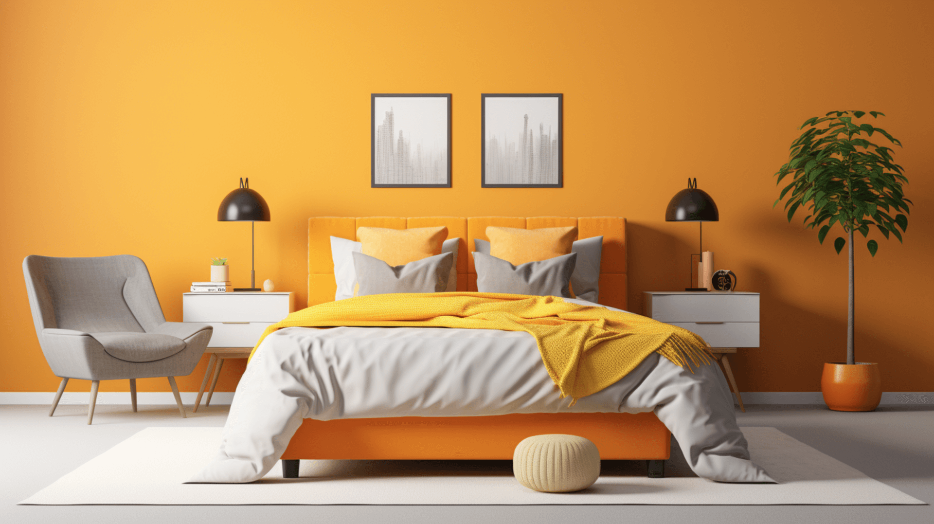
Exploring Warm and Cool Combinations

Exploring warm and cool combinations in your bedroom can create a visually striking and emotionally captivating atmosphere. By carefully selecting complementary colours from the warm and cool ends of the colour spectrum, you can achieve a balanced and harmonious look that enhances the overall aesthetic of your bedroom.
Here are three key considerations when combining warm and cool colours:
-
Balance: Achieving a balance between warm and cool colours is essential to avoid overwhelming or confusing the eye. For example, pairing a warm, earthy tone like terracotta with a cool, calming shade of blue can create a visually pleasing contrast.
-
Contrast: utilising warm and cool colours with high contrast can add depth and dimension to your bedroom. Consider pairing a vibrant, fiery red with a cool and tranquil shade of green for a visually striking effect.
-
Mood: Warm colours tend to evoke feelings of energy and excitement, while cool colours promote relaxation and calmness. By combining warm and cool tones strategically, you can create a bedroom atmosphere that suits your desired mood.
Exploring warm and cool combinations in your bedroom can add visual interest and emotional depth to your space. By considering balance, contrast, and mood, you can create a harmonious colour scheme that truly pops.
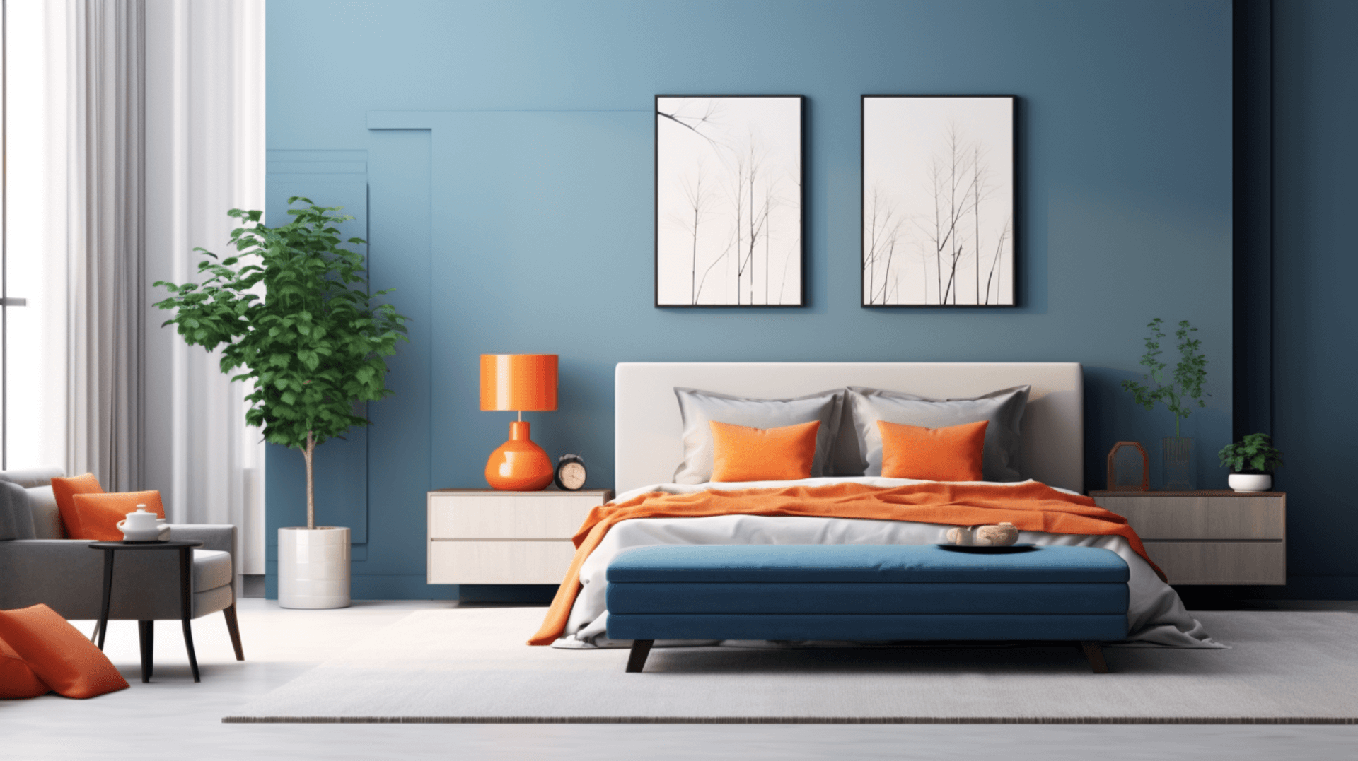
Embracing Bold Contrasts

Embracing bold contrasts in your bedroom can create a visually captivating environment that engages the senses. When it comes to complementary colours, bold contrasts can be achieved by pairing colours that are on opposite ends of the colour wheel.
For example, combining a deep, rich shade of blue with a vibrant, fiery shade of orange can create a striking contrast that instantly grabs attention. This bold combination can add a sense of drama and energy to your bedroom, making it a visually stimulating space.
Additionally, the use of bold contrasts can also create a sense of balance and harmony in the room, as the opposing colours play off each other in a harmonious way.
Overall, embracing bold contrasts in your bedroom can create a visually dynamic and engaging space that is sure to make a statement.
Incorporating Neutrals for Balance
Incorporating neutrals into the bedroom design can provide a sense of balance and tranquillity, creating a visually pleasing and harmonious space. Neutrals, such as whites, beiges, and greys, serve as a backdrop that allows the complementary colours to shine and prevent the room from feeling overwhelming.
Here are three ways to incorporate neutrals for balance in your bedroom:
-
Walls: Opt for neutral-coloured walls to create a calm and serene atmosphere. Shades of white or light grey can make the space feel larger and more open, while beiges can add warmth and cosiness.
-
Furniture: Choose neutral-coloured furniture pieces, such as a beige or white bed frame, to create a cohesive look. This allows the focus to be on the complementary colours used in accents and accessories.
-
Textiles: Incorporate neutral textiles, such as white or cream-coloured curtains, bedding, and rugs. These can soften the overall look and add a touch of elegance to the space.
By incorporating neutrals into your bedroom design, you can create a balanced and visually pleasing environment that promotes relaxation and tranquillity.
Adding Accents with Complementary colours

To enhance the visual appeal of your bedroom, consider adding accents in colours that harmonise with the neutrals in the space. Complementary colours, which are opposite each other on the colour wheel, can create a striking and vibrant effect when used as accents in a room.
For instance, if your bedroom features neutral shades like beige or grey, you could incorporate accents in shades of blue or green to create a visually pleasing contrast. These complementary colours can add energy and interest to the space without overwhelming the overall aesthetic.
Additionally, incorporating accents in complementary colours can help create a sense of balance and harmony in the room. By strategically placing these pops of colour throughout the space, you can create a cohesive and visually pleasing bedroom design.
Playing with Different Shades and Tones

Playing with different shades and tones can add depth and dimension to the visual composition of your bedroom, creating a harmonious and visually engaging space.
By incorporating complementary colours in varying shades and tones, you can create a balanced and dynamic atmosphere.
Here are three ways to play with different shades and tones:
-
Gradation: utilise a single colour in different shades, starting from light to dark, to create a soothing and gradual transition. This technique adds depth and creates a sense of calmness in the bedroom.
-
Contrast: Combine complementary colours with contrasting shades and tones to create a visually striking effect. This technique creates a lively and energetic ambiance in the bedroom.
-
Monochromatic: Stick to a single colour and use different shades and tones to create a cohesive and elegant look. This technique adds sophistication and depth to the overall design.
By experimenting with these techniques, you can transform your bedroom into a visually captivating and harmonious space.
Considering the Mood and Ambiance

In addition to playing with different shades and tones, another important aspect to consider when choosing complementary colours for your bedroom is the mood and ambiance you want to create.
colours have the power to evoke certain emotions and set the tone for a space. For instance, warm colours like red, orange, and yellow can create a cosy and intimate atmosphere, while cool colours like blue, green, and purple can promote a sense of calm and relaxation.
Furthermore, light and pastel shades can make a room feel more spacious and airy, while dark and bold colours can add drama and sophistication.
By carefully considering the mood and ambiance you want to achieve, you can select complementary colours that will truly make your bedroom pop and create the desired atmosphere for a restful and visually appealing space.
Using Complementary colours as a Focal Point

By strategically incorporating complementary colours into your bedroom design, you can create a captivating focal point that draws the eye and adds visual interest to the space.
Complementary colours are pairs of colours that are opposite each other on the colour wheel, such as blue and orange, or red and green. When used together, these colours create a vibrant and harmonious contrast that can make your bedroom pop.
Here are three ways in which using complementary colours as a focal point can enhance your bedroom design:
-
Contrast: The use of complementary colours creates a striking contrast that immediately grabs attention. This contrast can be used to highlight specific elements in your bedroom, such as a feature wall or a piece of furniture.
-
Balance: Complementary colours bring a sense of balance to your bedroom design. By incorporating both warm and cool tones, you can create a harmonious and visually appealing space.
-
Depth and Dimension: Using complementary colours can add depth and dimension to your bedroom. The contrasting colours create a sense of depth, making your bedroom feel more spacious and inviting.
By understanding how to effectively use complementary colours as a focal point, you can transform your bedroom into a visually stunning and inviting space.
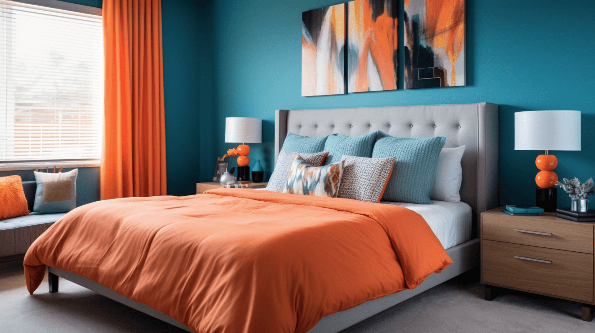
Combining Complementary colours with Texture and Patterns

The combination of complementary colours with various textures and patterns in your bedroom design creates a visually captivating and dynamic space.
By incorporating complementary colours, such as blue and orange or purple and yellow, you can achieve a balanced and harmonious look.
The use of different textures, such as plush fabrics or rough surfaces, adds depth and visual interest to the room.
Additionally, patterns can be used to create focal points and add personality to the space. For instance, a bold geometric pattern on the curtains or a floral print on the bedding can enhance the overall aesthetic.
By carefully selecting and combining complementary colours with texture and patterns, you can create a bedroom that is visually stimulating and aesthetically pleasing.
maximising Natural Light to Enhance colours
maximising natural light in your bedroom design enhances the vibrancy and richness of the colours, creating an inviting and uplifting atmosphere.
Natural light is a powerful tool for enhancing colours as it brings out their true qualities and creates a sense of depth and dimension. By allowing ample sunlight to enter your bedroom, you can showcase the complementary colours in their full glory.
The light interacts with the colours, illuminating them and making them appear more vibrant and intense. This not only enhances the overall aesthetic appeal but also creates a positive and energising ambiance.
Moreover, natural light has a transformative effect on the mood and perception of space, making the colours feel more alive and dynamic. By incorporating large windows, skylights, or sheer curtains, you can maximise the entry of natural light and create a visually stunning and harmonious bedroom design.
Tips for Painting and Decorating with Complementary colours

One effective technique for incorporating complementary colours in your bedroom decor involves carefully selecting hues that create a visually striking contrast and add depth to the overall aesthetic.
By choosing colours that are opposite each other on the colour wheel, such as blue and orange or purple and yellow, you can achieve a vibrant and dynamic look in your bedroom.
To successfully paint and decorate with complementary colours, consider the following tips:
– Use one colour as the dominant colour and the other as an accent to create balance.
– Experiment with different shades and tones of the complementary colours to create depth and dimension.
– Incorporate neutral colours, such as white or grey, to help tone down the intensity of the complementary colours.
– Consider the mood and atmosphere you want to create in your bedroom and choose complementary colours that evoke those emotions.
By following these tips, you can create a visually stunning and harmonious bedroom decor using complementary colours.
Transforming Your Bedroom with Complementary colour Accents

Transforming your bedroom with accents of colours that are opposite each other on the colour wheel can create a visually striking and dynamic atmosphere.
Complementary colour accents have the power to transform a dull and monotonous space into a vibrant and visually appealing one. By strategically incorporating complementary colours into your bedroom decor, you can achieve a harmonious balance that will make the room pop.
For instance, pairing blue with orange or yellow with purple can create a strong contrast that draws the eye and adds depth to the space. Additionally, using complementary colours in small accents, such as throw pillows, artwork, or curtains, can add a touch of excitement and visual interest without overwhelming the room.
The key is to find the right balance and experiment with different combinations to create a unique and personalised look for your bedroom.
Conclusion
In conclusion, understanding complementary colours is key to creating a visually appealing and harmonious bedroom. By referring to the colour wheel and selecting the right combinations, you can transform your space into a true work of art.
Incorporating texture and patterns, maximising natural light, and using complementary colour accents can all enhance the overall aesthetic of your bedroom.
With these tips and techniques, you can create a space that pops with vibrant, complementary colours, making it a truly inviting and stylish environment.